Color Separating Vector Graphics: A Practical Guide
Posted by Henry Philip
Filed in Arts & Culture 24 views
Introduction
A colorful design may look perfect on your computer, but printing that same artwork can become tricky when each color needs to be applied separately.
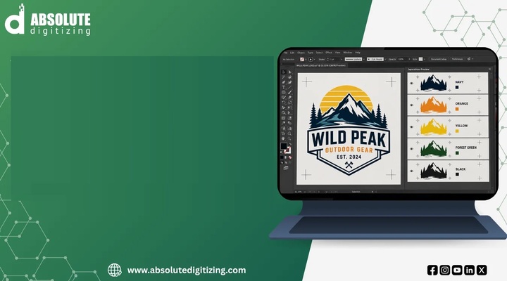
That is where color separating vector graphics becomes important. Instead of treating artwork as one complete picture, color separation breaks it into individual color layers that can be processed and printed correctly.
Think of it like taking a sandwich apart before preparing each ingredient. The complete design is still the same, but each part is handled separately.
Whether you are preparing artwork for screen printing, apparel, signage, packaging, or other production work, understanding vector color separation can help you avoid expensive printing mistakes.
What Is Color Separation?
Color separation is the process of dividing artwork into separate layers based on color.
For example, imagine a logo containing:
- Red text
- Blue graphics
- Black outlines
- White highlights
Instead of sending one combined image to production, the artwork can be separated into individual color components.
Each color layer can then be used to create the appropriate screen, plate, or production element.
This process is especially important for screen printing, where each ink color often requires its own screen.
What Are Color Separating Vector Graphics?
Color separating vector graphics are vector-based artwork files that have been organized into individual color components for production.
Vector artwork is made from mathematical paths rather than fixed pixels. This allows shapes to be resized without the same loss of quality associated with raster images.
Common vector formats include:
- AI
- EPS
- SVG
A properly separated vector file can make it easier for a printer or production team to identify exactly where each color should appear.
Why Is Color Separation Important?
Imagine sending a printer a complex design with six colors but no information about how those colors should be separated.
Someone would have to figure it out before production could begin.
Proper separation reduces that guesswork.
It can help with:
- Accurate color placement
- Cleaner prints
- Easier screen preparation
- Better registration
- Faster production
- Consistent results
- Reduced production errors
For businesses producing apparel or promotional products in volume, proper artwork preparation can save both time and money.
How Does Vector Color Separation Work?
The exact process depends on the artwork and printing method, but the basic workflow is straightforward.
1. Inspect the Original Artwork
Start by reviewing the design carefully.
Look for overlapping objects, gradients, transparency, outlines, shadows, and areas where colors interact.
A simple two-color logo may require very little adjustment, while detailed artwork can need extensive preparation.
2. Identify Each Production Color
Determine which colors need to be printed separately.
For example, a four-color design may be divided into four individual layers.
The goal is not always to reproduce every color visible on a computer screen. The separation should be based on the actual printing process and available inks.
3. Create Separate Vector Layers
Each production color is placed on its own layer or separated artwork element.
This makes it clear which areas belong to each ink color.
For example:
Layer 1: Black
Layer 2: Red
Layer 3: Yellow
Layer 4: White
The exact structure depends on the production requirements.
4. Check Overlapping Areas
Colors may overlap to create visual effects or compensate for printing conditions.
These areas need to be checked carefully to prevent unwanted gaps or overlaps.
5. Review Registration
Registration refers to how accurately different color layers line up during printing.
Even a small alignment problem can create visible edges or gaps.
Proper artwork preparation can include adjustments that help different color layers meet correctly.
6. Prepare the Final File
After checking the artwork, the separated vector graphics can be saved in a suitable production format.
The printer or production team may have specific requirements, so it is always wise to confirm the preferred file format before delivery.
Color Separation for Screen Printing
Screen printing is one of the most common applications for color-separated artwork.
In a basic screen-printing setup, each ink color is applied through a separate screen. The artwork therefore needs to communicate which parts belong to each screen.
For example, a three-color shirt design may require three separate color layers.
The printing sequence and ink behavior can also affect how the artwork should be prepared.
Spot Color Separation vs. Process Color
One important part of understanding color separation is knowing the difference between spot colors and process colors.
Spot Color Separation
Spot color printing uses specific ink colors for individual design elements.
It is often useful for logos, simple illustrations, and designs with clearly defined colors.
For example, a logo might use one red ink, one blue ink, and one black ink.
Process Color Separation
Process printing uses multiple ink colors to reproduce a broader range of visual colors.
The artwork is separated according to the requirements of the selected printing process.
This approach can be useful for detailed images and artwork containing many color variations.
The best method depends on the printing equipment, substrate, design, and desired result.
RGB vs. CMYK vs. Spot Colors
Screen colors and print colors do not behave in exactly the same way.
RGB
RGB is commonly used for digital displays. It combines red, green, and blue light to create colors on screens.
CMYK
CMYK uses cyan, magenta, yellow, and black inks and is widely used in many print workflows.
Spot Colors
Spot colors use specific prepared inks rather than building every color from process combinations.
When preparing color separating vector graphics, knowing which color system your printer expects is essential.
How to Prepare Vector Artwork for Separation
Good source artwork makes the separation process much easier.
Before sending your file for production:
- Use clean vector paths.
- Remove unnecessary objects.
- Check for hidden layers.
- Convert important text to outlines when required.
- Remove unwanted effects.
- Confirm the number of production colors.
- Check overlapping elements.
- Review artwork at the final production size.
- Confirm the printer's required format.
- Request a proof before large production runs.
These steps can prevent many common production issues.
Common Problems With Color Separating Vector Graphics
Even vector artwork can create problems when it has not been prepared correctly.
Too Many Colors
A design may contain dozens of small color variations that are not practical for the intended printing method.
Solution: Simplify colors based on the production process.
Unwanted Transparency
Transparency and blending effects may not translate properly into certain production workflows.
Solution: Check transparency and flatten or rebuild effects when appropriate.
Poor Registration
Separate color layers may not line up correctly.
Solution: Review registration and apply suitable trapping or overlap techniques where required.
Open or Broken Paths
Incomplete vector paths can cause unexpected gaps or shapes during production.
Solution: Inspect and clean vector paths before final delivery.
Unnecessary Effects
Glows, shadows, filters, and other digital effects may not be directly usable in some printing methods.
Solution: Rebuild complex effects using production-friendly vector shapes.
Trapping in Color Separation
Trapping is a technique used to reduce visible gaps between adjoining colors caused by small registration shifts.
For example, if a red shape touches a black outline, a tiny misalignment during printing could expose the background between them.
A slight overlap between the color areas can help prevent this problem.
The correct trapping amount depends on the printing process, substrate, ink, and production setup. It should not be applied blindly to every design.
Benefits of Professional Color Separation
Professional artwork preparation can be especially useful when dealing with detailed designs or commercial production.
A properly prepared file can provide:
- Cleaner color boundaries
- More predictable production
- Easier screen preparation
- Better print registration
- Fewer revisions
- Reduced production waste
- More consistent results
At Absolute Digitizing, artwork can be prepared with production requirements in mind, helping businesses turn complex designs into cleaner, more practical vector files for printing.
When Should You Hire a Professional?
You may be able to separate a simple two-color logo yourself.
However, professional help can make sense when:
- The artwork contains many colors.
- The design includes gradients.
- Multiple elements overlap.
- Fine details must remain clear.
- The artwork will be printed in bulk.
- You need specific spot-color separations.
- The printer has strict file requirements.
- You are unsure how to prepare the artwork.
A small investment in proper artwork preparation can prevent much larger production costs later.
Practical Tips for Better Color Separation
Keep these tips in mind when preparing production artwork:
Keep the Artwork Organized
Use clear layer names and remove unnecessary objects. An organized file is easier for another person to understand.
Work at Final Size
Always inspect important details at the size the design will actually be printed.
Avoid Unnecessary Complexity
If a visual effect does not need to be reproduced, removing it can make production easier.
Communicate With the Printer
Every printing process has different requirements. Ask about colors, file formats, trapping, registration, and separations before finalizing the artwork.
Always Proof the Design
A digital proof can help identify obvious issues before production. For larger orders, a physical sample may provide even more useful information.
Conclusion
Color separating vector graphics is an important part of preparing artwork for professional printing. By dividing a design into clear, production-ready color layers, you make it easier to create screens, apply inks, and reproduce artwork consistently.
The process involves much more than simply placing each color on a different layer. You also need to consider registration, trapping, color systems, transparency, vector paths, and the requirements of the printing method.
For simple artwork, you may be able to handle basic separation yourself. For complex logos, detailed illustrations, or large production orders, professional artwork preparation can help reduce errors and improve the final result.
The key is simple: prepare the artwork for the way it will actually be printed, not just for how it looks on your screen.
FAQs
1. What are color separating vector graphics?
They are vector artwork files divided into separate color components so each color can be processed individually for printing or production.
2. Why is color separation important for screen printing?
Screen printing commonly uses a separate screen for each ink color. Color-separated artwork helps identify the exact areas that should appear on each screen.
3. Can any vector file be separated by color?
Most editable vector artwork can be separated, but complex effects, gradients, transparency, and overlapping elements may require additional preparation.
4. What is trapping in color separation?
Trapping creates a small overlap between adjoining color areas to help reduce visible gaps caused by minor registration shifts during printing.
5. Should I separate my artwork myself or hire a professional?
Simple designs with a few solid colors may be manageable yourself. Complex artwork, detailed logos, or bulk printing projects may benefit from professional color separation.